Tuesday, 24 November 2015

Costumes

The costumes for our music video aren't going to be a focus for the viewers and so we're planning to keep them discreet. We are using them to represent stereotypical male and female teenage characters and the drawings below show our rough ideas. They aren't striking and so allow the focus to be on the characters themselves, and the emotions they're trying to portray. 

Connie will have several costume changes; we'd like her to be wearing different clothes in each lip syncing location, as this will hopefully suggest the idea of time passing. 

We also plan to subtly change her clothing depending on whether she's alone or with her partner. When she's alone the clothing will be more suited for colder conditions (i.e. big jumpers and jackets or woolly hats etc), and when she's with her partner her clothing will be less. This subtly emphasizes her loneliness in her scenes without the partner as it show's the audience she lacks the warmth she had when she was with her partner; however, this will be minimal as we don't intend for it to be distracting.

Below is one of our initial sketches showing our ideas for costume design in the music video. 


Friday, 20 November 2015

Lip Sync Practice


For our music video, Connie will have to lip sync in several scenes. In order to make the lip syncing appear genuine we had some practice sessions (Lucy and I also took part to make Connie feel less pressure). 

We discovered that actually singing the lyrics rather than mouthing them looks much more realistic (from around 1:20 Connie does her best lip syncing), and also that subtle facial expressions are much more effective in conveying true emotions (more obvious, and over the top movements look unprofessional and less believable).


Thursday, 19 November 2015

Location Research


Here we're looking at some potential locations for our music video. 

In the video above we're at Meadfoot (the beach) in the weather conditions we want for our beach scenes, a very grey and miserable backdrop - to emphasise our characters loneliness and negative emotions. Unfortunately as the tide was in we had very little room to do test shots; however, it gave us a good indication of what our beach scenes will look like. 


We also went to Dawlish Warren (see below) to see if the beach there would be more effective, due to its more remote location. In terms of practicality however, Meadfoot would be much easier for filming, so, as our filming is weather dependant, we will have to play it by ear as to which location we use. We'll look at forecast for both Dawlish Warren and Meadfoot and see which one provides us with the maximum time in the weather conditions that fits all our schedules.


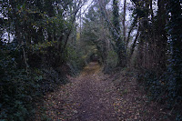
We also went to two woodland locations, the one featured in the video above (Daddyhole Plain) and also a woodland path in Highweek village (see below). Like Meadfoot, Daddyhole Plain's benefit is its accessibility; however, the Highweek woodland path fits our vision more. The path also leads to a graveyard which is perfect for our final scene and so we've chosen the Highweek woodland path to shoot our wood scenes (and graveyard scenes) as, despite it taking more effort to get to, it will provide more aesthetically pleasing footage. 


In terms of the house scenes, we've chosen Connie's house due to it being near the school which will ease the pressure of time constraints. Her lounge's pastel pink walls also provide a warm and atmosphere that will be desirable for our scenes as we want them to appear cosy and intimate.

Storyboard


Tuesday, 3 November 2015

Story Boarding (Vlog 3)


Today we did some further planning towards our storyboard; focusing a lot more on the specific timings and how we will use our locations and shot styles to match the changing tone of the song. 

We feel it will be near on impossible  to create  a shot for shot storyboard because our music video is weather dependant in places, and obviously, even though we can have an idea of what we'd like, shots like this will be unpredictable. However, we are nearly there in terms of our basic storyboard of shots and timings.


Following on from this lesson, I created much more detailed storyboards. The image on the left shows this progression. The storyboard at the top of the picture is our original: a very basic plan of timings and locations. Below this is the more detailed storyboard (however, in the image it is unfinished as only one shot has a drawing). The descriptions are more detailed, and the shots are more specific. For example, in the original storyboard, the first box says: 'Beach 6secs' whereas the second storyboard this is split into two boxes, with two different beach shots - the first shot being 0.00-0.04 and the second being 0.04-0.06.
This improved storyboard will give our filming more structure; however, there is still the potential for changes due to our reliance on the weather.